Alnwick Soap Co
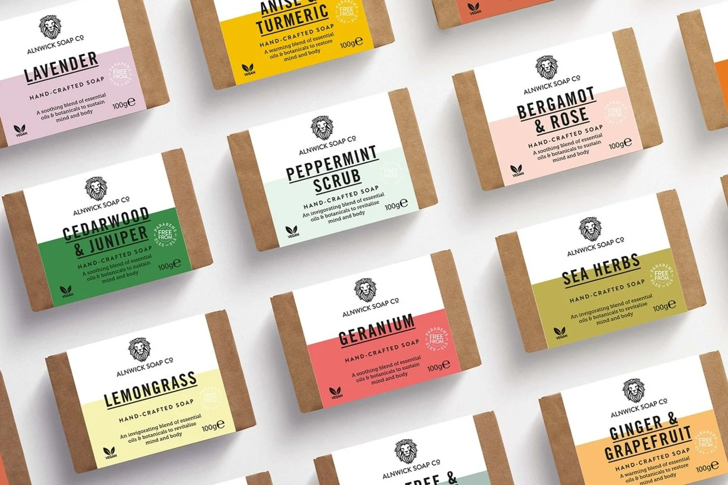
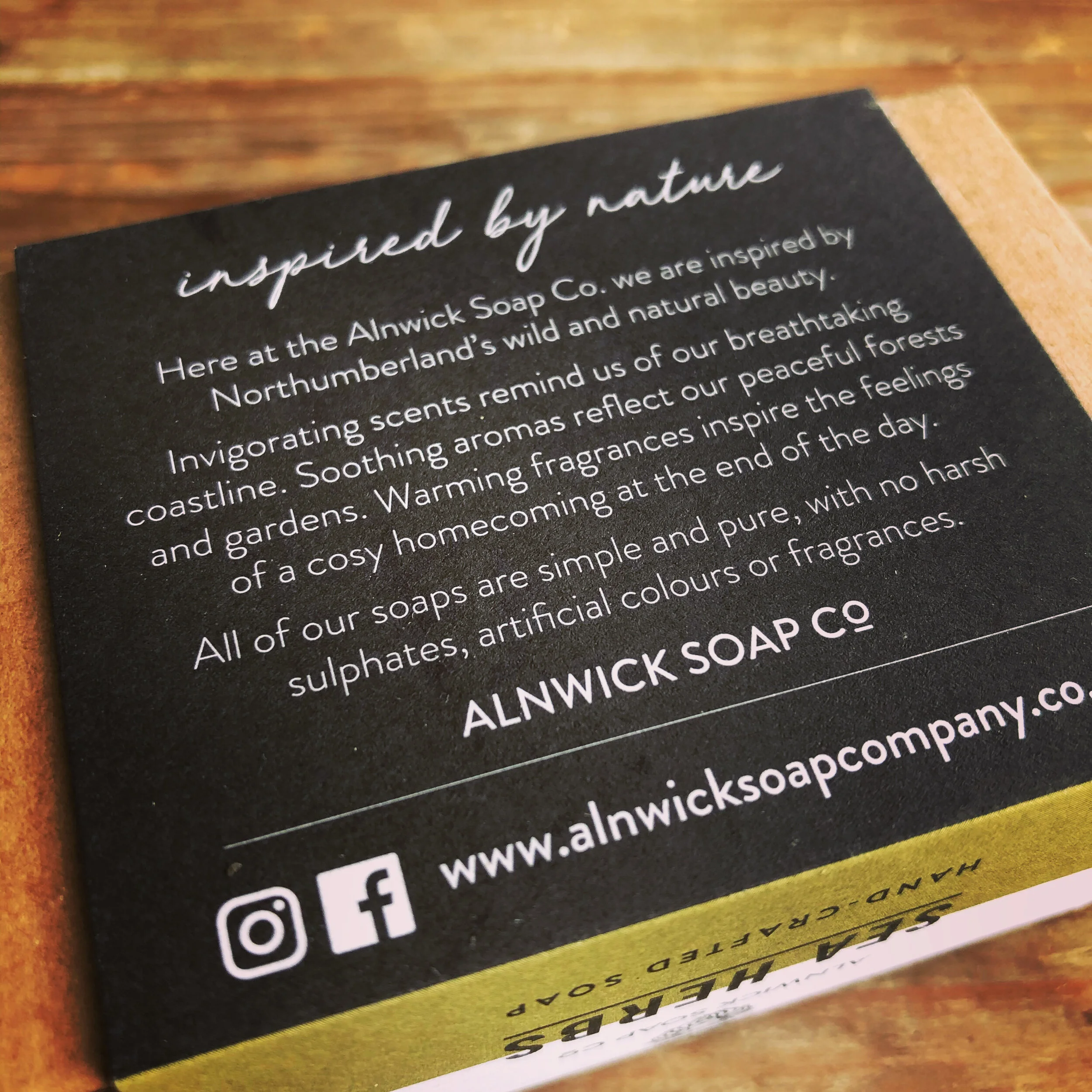
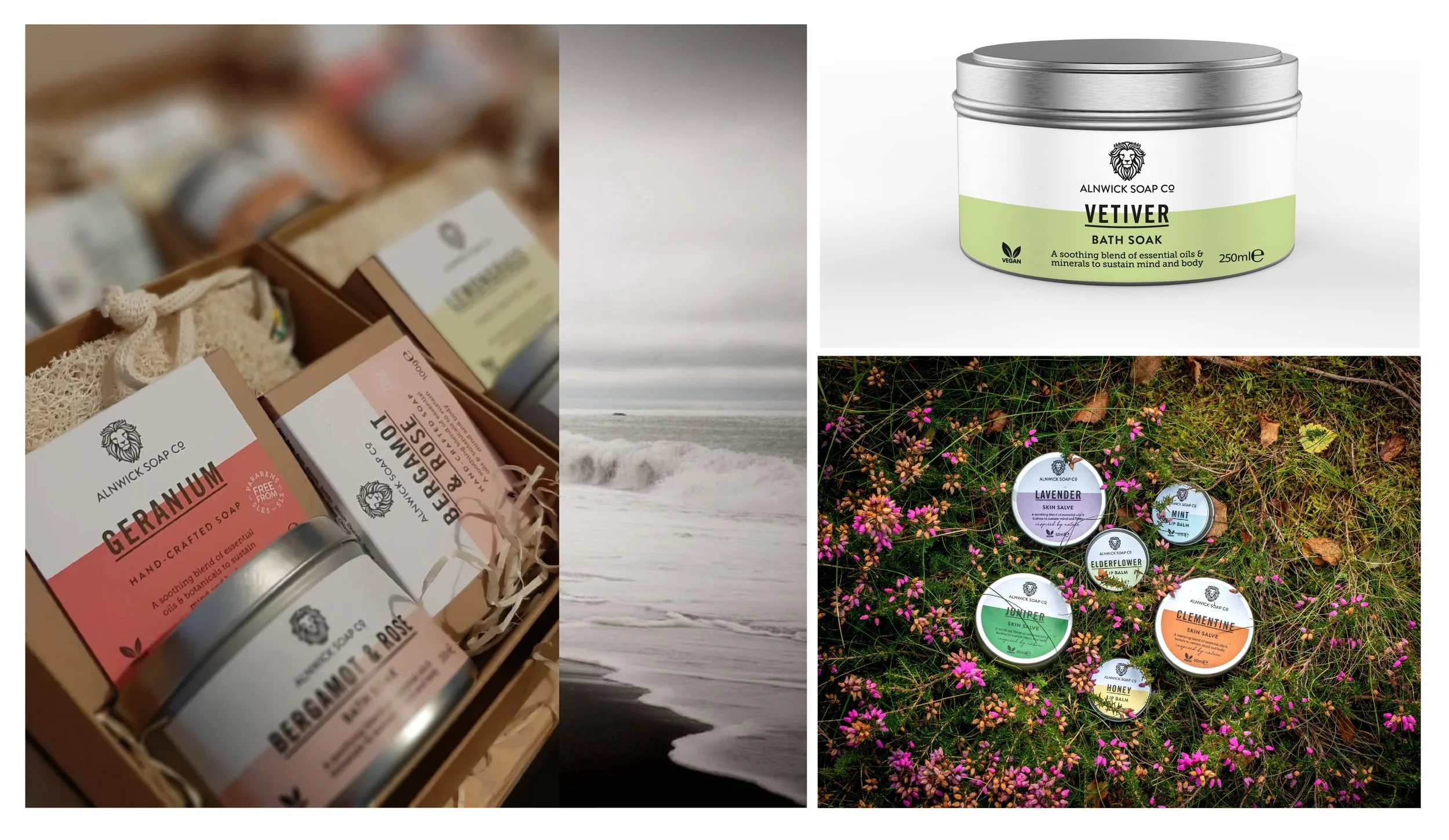
What could be more timely than launching a hand-crafted essential oil based soap company during a pandemic? My client had been working on developing the product for over one year and was at a stage where she required branding and packaging. She wanted to launch 12 SKUs but as a small startup, the print quantities were low and we wanted easy fulfilment for her – less time packing means more time making and developing product. The company has strong eco credentials so of course we needed to follow this through to packaging. The solution was to purchase off-the-shelf kraft boxes and create 12 different sleeves that she could simply slide over the boxes. Colour blocking eases navigation: I used an ‘earthy’ and subdued palette. I created claims badges to further communicate the product’s many quality and ethical credentials. We have two ‘selling faces’ – top and front – depending on how these are merchandised in various shops. The back panel is dedicated to brand copy and communicating the 3 tiers of product: Invigorating, Soothing and Warming.
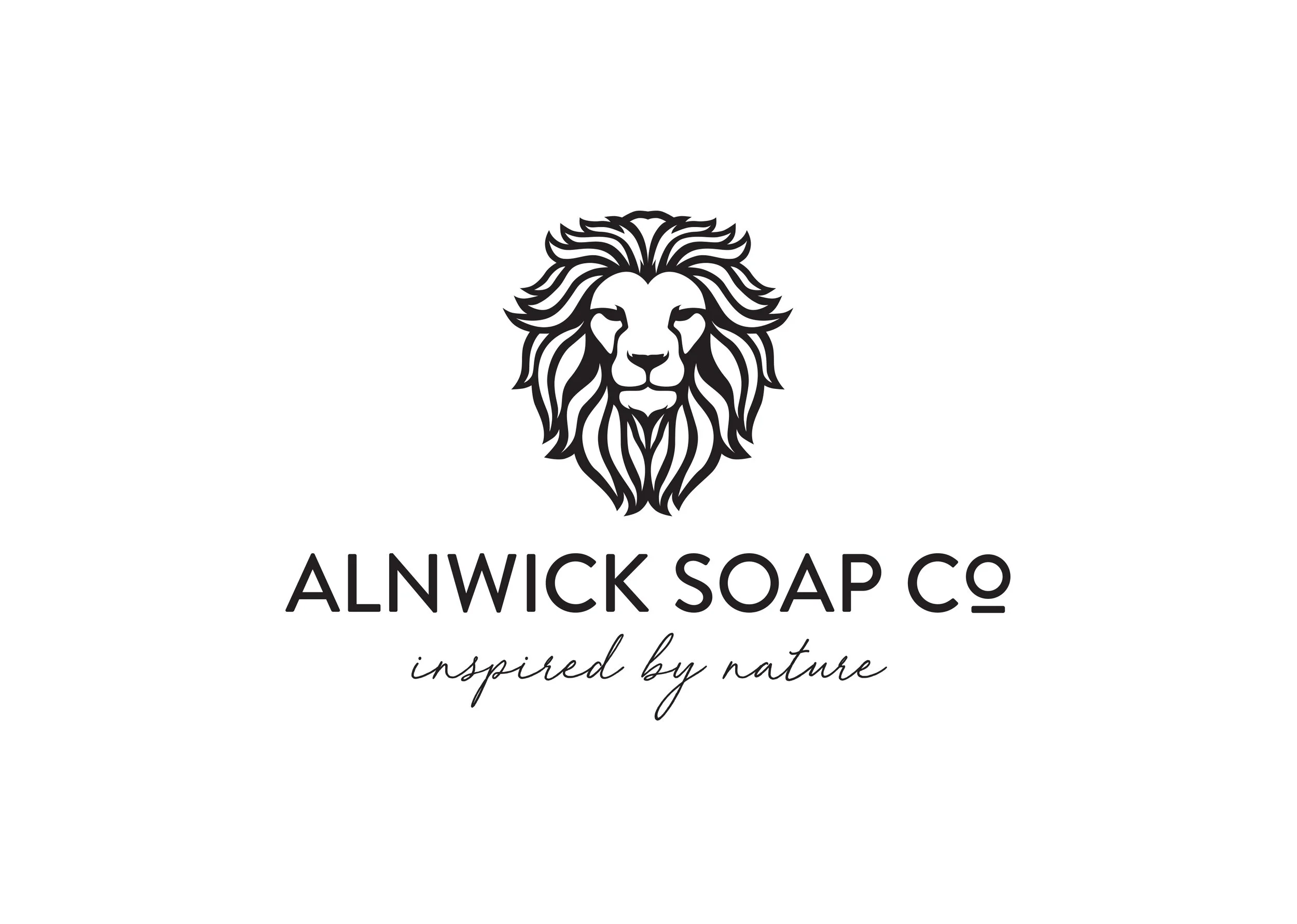
For the logo, the brief was to go clean and contemporary and incorporate a lion’s head (a symbol of Alnwick). I looked at many many lion’s heads – we wanted ‘pride’ but not ‘anger’ – we both liked the dishevelled mane of the final drawing. To come up with a strapline, we both threw all the words that we felt summed up the brand’s vision, and from that, I developed several straplines. The chosen one is ‘inspired by nature’: it marries up the product to the place (Northumberland) and is the overarching mission statement for the brand going forward.
